Brand
guidelines
How Good To Go looks, sounds and stands out. Use this whenever you make anything with our name on it.
The idea
Stand out from the flock.
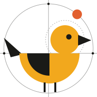
Small businesses compete against brands with a hundred times their budget. Our job is to make them impossible to miss. The Go bird is that idea in one shape: the one yellow bird in a crowd of black ones, standing tall, beak forward, ready to fly. Ready to go.
Everything we make is constructed. Circles, arcs and straight lines, with the construction left visible. It shows the thinking behind the work and it’s how AI-made content gets its craft back: a clear system, applied with taste.
Logo
The Go bird and the stacked wordmark. Use the lockup wherever there’s room; use the mark alone for avatars, favicons and small spaces.
 Good
to gostudio
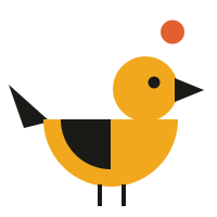
Primary lockup. Mark height equals the wordmark’s cap height × 1.7. Wordmark: Big Shoulders Display Black, uppercase; “studio” in IBM Plex Mono Medium.
Construction. Body is a half-circle (r 62), head a circle (r 30), wing a quarter-circle (r 46). The orange “go” dot always sits on the outer orbit, top right.
Clear space. Keep a margin of at least x on every side, where x is the diameter of the bird’s head. Minimum size: mark 24 px / 8 mm, lockup 110 px / 30 mm wide.
Colourways
Full colour on Paper. The default.
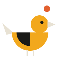
Reversed on Ink.
Reversed on Dusk.
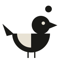
One colour, for Mustard or single-ink print.
Don’t
Stretch or squash it.
Recolour the bird. It’s always Mustard.
Flip or tilt it. The bird always faces forward, to the right.
Add effects or set it on busy backgrounds.
Colour
Printed-paper neutrals carry the brand. Mustard is ours. The accents come in one or two at a time, never all at once.
#E8E2D4 · RGB 232 226 212Backgrounds. Our blank page.#1A1A17 · RGB 26 26 23Type, lines, the flock.#F2A81D · RGB 242 168 29The Go bird. Primary buttons, highlights.#E2602F · RGB 226 96 47The go dot only. Small and singular.#E5437C · RGB 229 67 124Accent for energy: flags, video, motion.#3E7392 · RGB 62 115 146Calm accent. Halos behind the hero.#3D5A3A · RGB 61 90 58Savings, success, nature subjects.#B9B54A · RGB 185 181 74Supporting illustration colour.Proportion
Roughly 60 / 25 / 8 / 7. If a layout feels loud, add Paper.
Approved text pairings
Never set small text in Mustard, Lime or Pink on Paper — they don’t meet contrast minimums.
Type
Three families, each with one job. All free on Google Fonts.
Big-agency creative.
Headlines, prices, big numbers, the wordmark. Tight and stacked, like a poster.AI does the heavy lifting. People do the deciding. You get a brand that looks like you, in days.
Paragraphs, buttons, navigation. 17–21 px on screen, 9–11 pt in print.Small
brands
big
worlds
Display XLReady when you areDisplay LPick a packDisplay MBrand identityBody 18Logos, brand kits, social content, ads and video.Caption 13First concepts in 48 hoursGraphic language
The postcard: raw above, refined below. Our illustrations turn real subjects into constructed geometry.
or reference
The postcard format: photo on top, geometric translation below.
Construction layer: 1 px Ink lines at 35–50% opacity, guide dots at intersections, one solid dot on an arc.
The building blocks. Nothing else. No gradients except the sunset in video work.
- Build every illustration from circles, half and quarter circles, triangles and squares.
- Leave the construction visible: the circle it was drawn in, the axis lines, the guide dots.
- Add print grain. Flat fills get a fine speckle so they feel inked, not rendered.
- Pair a stacked uppercase caption (3–5 short words, IBM Plex Mono) top-left with a page number top-right.
- One hero colour per image. Everything else is Ink, Paper or one supporting accent.
Voice
Confident, plain and a little cheeky. We sound like a sharp friend who happens to run a studio.
Big-agency creative. Small-business price.Primary line
Stand out from the flock.Brand idea
You’re good to go.Sign-off. Use at the end of a flow, a video or an email.
- Lead with the outcome and the number: price, days, deliverables.
- Say “AI” plainly and proudly, and always say what the humans do too.
- Short sentences. Sentence case in copy; uppercase only for display type.
- Buttons say exactly what happens: “See pricing”, “Start with Launch”.
In use
A few starting points for everyday pieces.
Goodto gostudio
Big-agency creative.
Small-business price.
Your name
Creative director
hello@goodtogo.studio
goodtogo.studio
001
—
Stand out
from the
flock.
Launch pack
—
$2,490.
10 days.
Done.
Social posts: 1080 × 1080. Caption top-left, headline bottom-left, mark bleeding off the bottom-right edge.